Social media advertising can be a great place to move the needle on your marketing initiatives by finding new customers and engaging with old ones, right where they are already spending a large chunk of their time. But how can you compete with a cute dog video, or a friend’s big engagement announcement all happening within the same feed? When you consider that the average American smartphone user scrolls through more than 300 feet of content each day—around the same height as the Statue of Liberty—it is clear how important it is for advertisers to produce creative content that can compete with their audiences' heavily divided attention.
So how does one produce scroll-stopping creative for their social media advertising campaigns? We’ve compiled some of the best practices to consider during the design phase of campaign planning. From psychology to sizing, these tips will ensure your campaigns have compelling creative that drives results.
1. Design with your audience in mind
Always keep the end user in mind when creating graphics. Be sure to include photos that represent your audience's interests; aim to elicit an emotional response from them through your graphics. This will grab their attention more quickly, increasing the likelihood that they will click and take the desired action on your ad.
Example:

Targeting new moms, this ad creative is relatable and relevant to their audience.
2. Make sure your images have the correct ratios
Unfortunately there is no "one size fits all" when it comes to social creative specs. It is important to ensure that your creative assets are the appropriate size for each platform. If you plan to run ads across multiple platforms, you'll want to be certain you've developed the correct sizing ratios for each one (ex. landscape vs horizontal vs square). Choose your components and layout with the assumption that you'll be producing several formats or sizes.
We’ve linked to each platforms sizing and specifications here:
3. Use photos of real people
Stock photos can be a great tool for designers that need to create new content with a time crunch, but should be avoided for social media ads when possible. Stock imagery is often easy to spot, and the same model may also be used in the pamphlet at your doctor's office, a local salon menu, and essentially anyone else’s advertisements.
These images are very easy to scroll past on a feed full of memes and funny videos, so it is important that any images of people come off as authentic, and possibly even mistaken as a friend’s organic content.
Sourcing genuine photos can be something accomplished internally, or potentially crowd sourced from users sharing an experience with or about your business. Just make sure to reach out for permission before using any user-generated content.
Example:

By featuring an actual Stitch Fix customer, this ad’s creative appears less like an ordinary ignorable ad and more like organic content. Having a more organic feel will help the audience relate more to the content and ultimately capture their attention.
4. Use motion when you can
If a picture is worth a thousand words, how many words is 24 pictures a second worth? In a crowded feed, any kind of motion (from a full video to a simple gif) can catch your audience's attention. Video format also allows you to share more photos and information while using less real estate. A simple way to get started with adding motion could be a slideshow ad showcasing different elements of your business, or by animating any text that appears on your creative.
Example:
While this animation is minimal, it is effective. The same creative would have worked as a static image, but rotating the graphics around the text, it adds an additional layer of interest to help capture the attention of your audience.
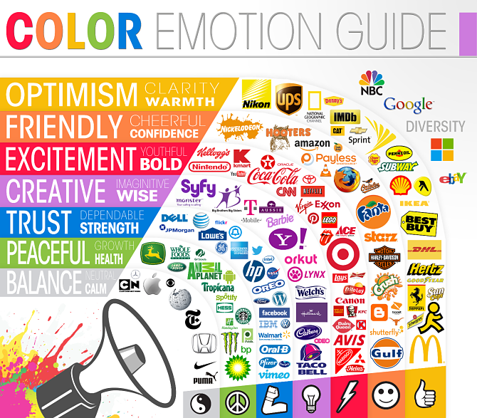
5. Consider the psychology of color
The colors you choose for your Facebook ad might be just as significant as the images or content. According to a study published in Management Decision, color accounts for up to 90% of all product-related snap judgments.
For example, color can be used to:
- Capture the attention of users by using contrast.
- Establish your brand identity (for example, the color blue used by Facebook).
- Align your business with specific sentiments or feelings.

Source: Color Psychology
A well-thought-out social media ad design can help you get noticed and tell a story. Each of these suggestions can help, but it's important to consider how to best apply them to your unique use case. It's crucial to note that design isn't the only factor that contributes to the success of an advertisement. To achieve results, great ads also require compelling copy and a strong overall advertising strategy.
Whether your brand is just getting started with social media advertising or looking to improve existing ones, you’re in the right place. If you’re looking to move the needle, we would love to chat with you to see how Jordan Digital Marketing can help drive real results.