LinkedIn advertising may not have all the creative functionality of other social media platforms, but good creative is still pivotal for the success of its campaigns.
Along with knowing the advertising options and creative specs, which you can find here, l’d like to recommend some fundamentals for developing creative that entices your users to take your desired action. (Many of these fundamentals aren’t specific to LinkedIn, but they’re key to dialing in performance on this particular platform.)
Let’s get started.

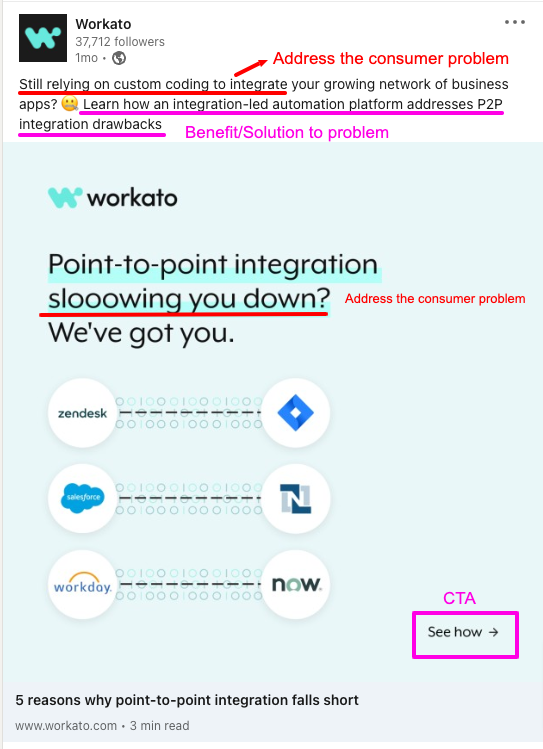
Address a pain point with your ad copy
The best way to approach LinkedIn ad copy is by understanding – and then clearly conveying – the benefits of your offer to your audience. Note that by “offer,” I don’t necessarily mean your product or services. Your offer is essentially your call-to-action. It can be anything from an eBook to a webinar to a demo request.
Your audience will likely only click on your ad if you are advertising a clear solution to a current problem they have. (This is one of those principles that applies across advertising channels.)
Before writing your ad copy, you should know what customer pain points your offer solves. Clearly defining this solution in your ad copy will help in driving desired results. Highlight the benefits your audience will receive by accepting your offer, rather than the features of the offer itself. Features are the technical aspects of your offer–what it does. Benefits define why your audience should care about your offer and how it will help them relieve a pain point, learn something new, make their job easier, etc.
Here’s a great example from Zeck:

Keep your copy simple
When writing ad copy, remember that you only have seconds to capture your audience’s attention. If your ad is too technical or written at a college level, your reader may lose interest quickly. Write your ad copy in a way that a grade-schooler could understand it. Avoid using jargon, unless your audience is super technical (e.g. engineers) and will want someone to approach them using their language.
Spend extra time getting your ad intro text right
The most important piece of your ad is the introduction text. In a Sponsored Content Ad, this is the section that appears just above your image or video. It’s here that you can really sell what it is you’re promoting by highlighting the benefit of your offer.

Longer ad copy is more likely to lose a reader’s interest, so keep it short and sweet. Your text is cut off, or truncated, at 150 characters. Readers can click the “…see more” to read the full message. Note that longer ad copy can be effective as long as you make those first 150 characters captivating to your audience.
Addressing the consumer’s pain points from the start will help keep them engaged long enough for you to deliver the solution.
Use a clear call to action
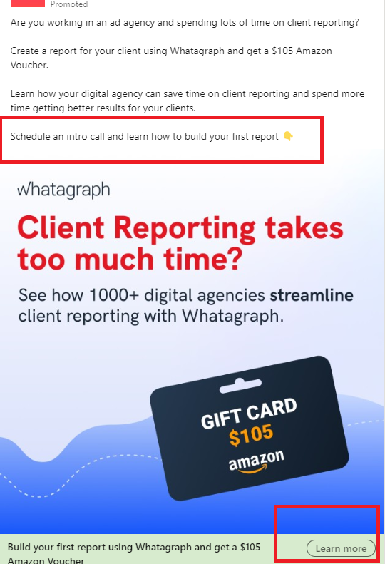
Finish off your introduction text with a call to action (CTA). Again, this is going to be unique to your offer. It might be something like clicking to visit a page of your website, booking a call, downloading a piece of content, or watching a video.
Linkedin provides a customizable CTA button linked at the bottom of your ad:

It’s a good idea to go beyond, as the ad above did, to use the intro text to verbally guide your reader to the next step. This can be as simple as saying something like, “Click to download your FREE whitepaper” or “Click to access this EXCLUSIVE Playbook.”
It’s best practice to save your CTA for the end of your introduction text; don’t state it at the beginning and then distract your audience from the desired action with more description. The sweet spot: address your consumer’s pain points from the start to keep them engaged long enough to deliver your offer’s solution and CTA.
Pack a punch with your headline
The headline is the text that appears just below your image or video. If your audience is quickly scanning your ad, this may be the last thing they read before scrolling on.
As with other text elements, keep your headline simple and lure your reader in with a solution to their problem. Repeat what you’ve already said in your introduction by posing a question or telling them exactly what you’re offering in one sentence. A couple of examples might be: “5 Reasons You Need X For Your Business | FREE Whitepaper” or “HR Leaders Need To Ask These 3 Questions to Find the Right Applicants.”
Use imagery that pops
Some might argue that the creative is the most important aspect of your ad. While that may be more true on other platforms like Facebook and Instagram, the ultimate goal of your creative on LinkedIn isn’t to elicit action; it’s simply to get people to stop scrolling.
One sure-fire way to do this is by making your creative stand out by avoiding the use of LinkedIn’s color palette (blue, gray, and white) in your creative. Brighter colors such as orange, yellow, or pink offer a noticeable contrast and are sure to make your ad stand out.
Also, make sure your image is sized correctly. Depending on the size, your ad might only be served to mobile or desktop users, if the image is too small or large to show everywhere. Recent tests show that Linkedin favors square imagery (1200 x 1200 pixels), so it’s best to avoid horizontal if you can.
If you include any text within your image, keep it brief (under seven words) and use the rest of your copy fields to convey your message.
Test!
Keep in mind that your ad copy/imagery may not always work right away and will need to evolve over time. A/B testing different variations of creative (while leaving all else the same) will help keep things fresh and allow you to see which variation resonates more with your audience; A/B testing offers and themes (i.e. calling out different pain points) is critical to include in your testing strategy as well.
Though this is not an exhaustive list, the guidelines shared here should help give you a strong foundation for high-performing LinkedIn ads (assuming your targeting is solid, of course). If you have any questions about LinkedIn strategies that work, drop us a line! We’re here to help.
