Everyone, in every industry, knows Google’s search experience is changing. That’s certainly true of eCommerce, where Google results are looking more and more like marketplace pages these days:
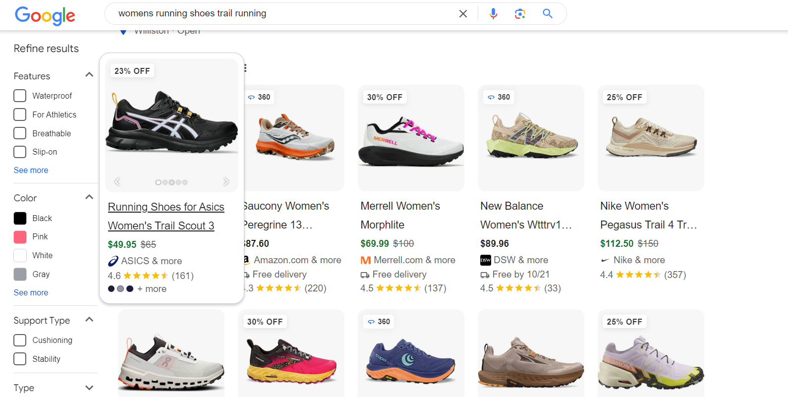
A recent Search Engine Land article talks about how we got here – which is important context leading us to one big takeaway: it’s time to pay more attention to your product page content.
Let’s look at some under-utilized and emerging ways to help bring more visitors to your pages – and to convert more of them when they get there.
1. Speak directly to your users
The first example we’ll look at, from On Running, does a good job of calling out hallmarks of the users who would appreciate each model:
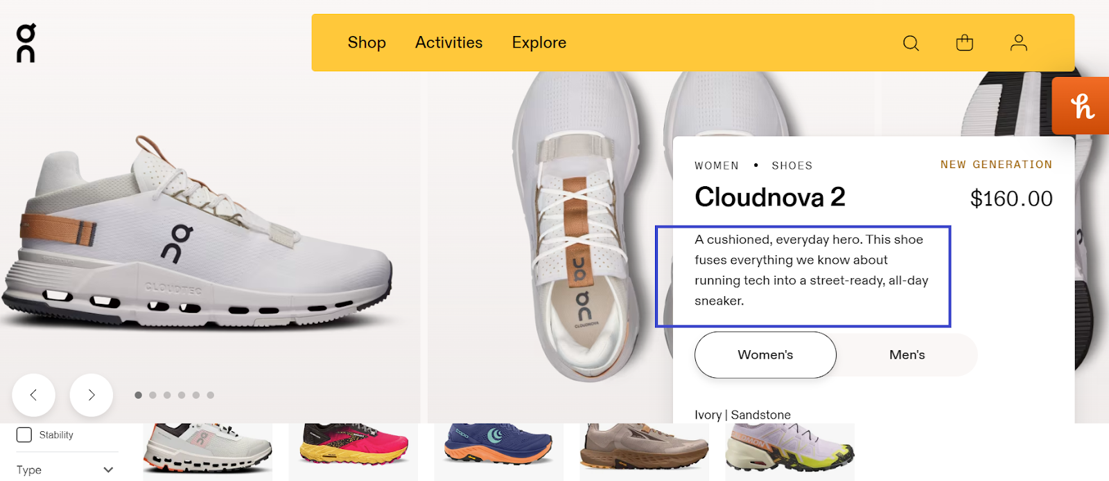
On Running speaks directly to users who want comfortable, durable, technically advanced shoes to wear around town – and to rip off regular runs.
2. Speak to key features and benefits early on
The product description highlighted above packs a punch in a few words, but it doesn’t need to stop at that. On makes the user scroll further down the page, far below the fold, to find other key features and their benefits:
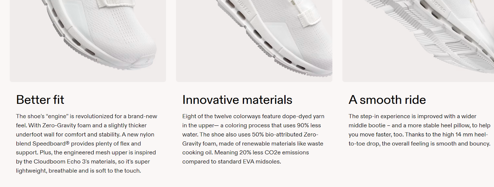
As a runner and someone who cares for the environment, I look for sustainability and fit – specifically, I like lightweight shoes that still offer plenty of cushioning. Calling these benefits out in the section above the fold would have been a smart play for On to make the page stickier – and it would also have enabled natural use of great keywords like “eco-friendly running shoes” and “lightweight running shoes for stability” further up the page.

3. Use your most valuable real estate (hint: it’s above the fold)
I’ll cut On a break for a second and look at Merrill, a well-established brand for trail/hiking shoes and boots. Merrill’s product pages have a ton of good information, including product reviews and contextual use case information the brand knows its users need to know:
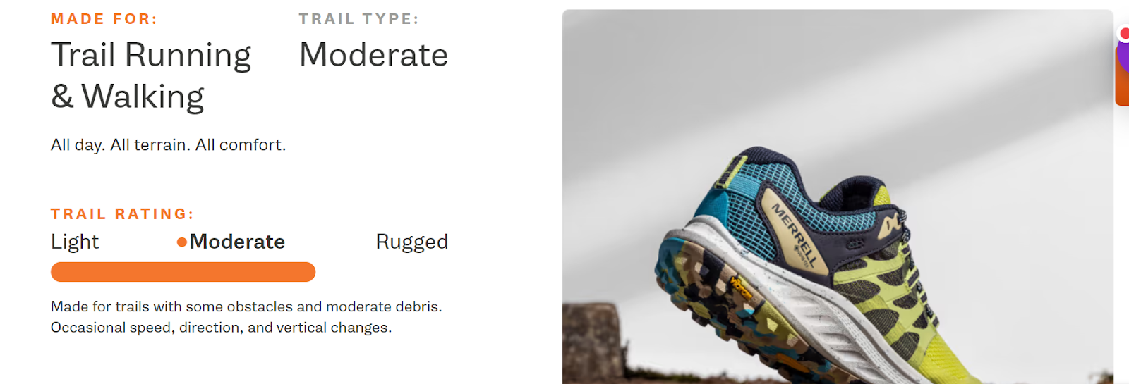
The flip side: all of that information is far down the page. This is what the user first sees upon hitting a Merrill product page:
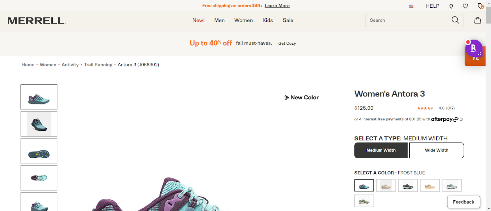
Lots of whitespace, very little information to say who should consider the shoe (or why). Having a super-enlarged image (or range of images) is a good idea, but I would argue it’s smarter to give the user a click-to-enlarge option and present a combination of imagery and informational copy – particularly if the copy includes strategic keywords and the layout makes it clear that there’s more to learn from scrolling.
4. Make shopping easier for your users (and leverage internal linking)
On has a great range of shoes, including this waterproof model. But they suffer from a lack of on-page merchandising, including accessory products like socks and beanies that would be great compliments to shoes intended for use in tough weather conditions.
Users can always add accessories after adding the shoes to the cart, but On is missing internal linking benefits here – and relying on the user to remember that even the most comfortable running shoes can feel bad with incompatible socks (e.g. if the shoe has a high heel back, recommend mid-calf socks that don’t leave room for blisters).
While we’re on the subject of internal linking, you may also have options to link to educational content – for instance, if On had a blog that explained the why and how beyond its Zero Gravity Foam, a link with “How Zero Gravity provides elite cushioning below X ounces” could prompt interested users to open another tab and geek out about the shoes’s unique engineering benefits.
5. Involve your users
Product reviews are table stakes for most brands (On is an exception), but FAQ sections that get updated as user questions roll in are also extremely impactful. For each user who asks a question about a product, there are five more who bounce without asking, so there are real conversion benefits to posing and answering common questions directly on the product pages.
You can glean FAQ entries from Contact emails, social media profile engagement, and Customer Service communications – and those inputs can be incredible sources of ideas for valuable long-term queries to pick up incremental traffic. We work with our clients to incorporate info from all of these sources, which helps them stay ahead of the conversational curve and slower-to-update Google info to speak more directly to emerging user needs.
6. Remember readability and visual UX
Icons, graphics, bullet points, iconography, highlight colors – as long as the most important content is crawlable by Google and easy for the user to digest, you’re striking a good blend of readability and richness. Make sure you’re going beyond including the right information – each product page should follow a strategic information architecture that tells the user (and Google) what they need to know, in the most intuitive order and layout.
On has a great example of a digestible layout for the secondary layer of information, beyond model and price:

Wrapping up
If you have a product catalog in the hundreds, you may be breaking a sweat after reading this, but there’s no need. Start by identifying key products with either low impression volume or relatively low CVR, and test these recommendations on those to gauge the effects over time. Even in the rush of the holiday season, doing something as simple as pulling more information above the fold to speak directly to your users could move the CVR needle – which your colleagues in paid media will appreciate as well.