Whether you’re advertising on Instagram, TikTok, Pinterest, Snapchat, LinkedIn, programmatic, the GDN, etc., good creative is essential for maximizing performance.
Good creative, of course, is underpinned by a fundamental understanding of your top audiences. Their challenges, preferences, needs, and aspirations – not to mention their state of awareness and/or intent – need to be highlighted in your imagery and messaging to prompt them to take your desired actions.
At JDM, we’ve boiled down the process of making great creative to three steps: persona development; testing strategies based on those personas; and segmentation according to the stages of the user journey.
Let’s break each stage down.

Persona Development
Basic attributes for persona development include demographics (urban/rural, age, gender, parental status, etc.), professional industry, interests, challenges, needs, and desires.
If you have account history, a great place to start is your first-party data: clients and customers. At scale, you can find common themes from the above list to help define your personas. If you can access any qualitative data, like customer reviews, user ratings, customer surveys, and even common questions from your customer support team, aggregate those for a layer of additional persona insights.
For instance, if you’re advertising a line of compact passenger vans, and you find that your key demographic is soccer moms, your customer support team may be able to add depth to the challenges (easy-to-clean seats) and goals (fit many kids safely, with ample trunk room for equipment) they bring to their purchase decisions.
Creative Testing
Whether you’re working to connect with one or multiple personas, it’s essential to map out a testing strategy to see how various elements resonate. We recommend starting with broad themes, then getting more granular.
The first wave of tests often includes:
- Illustration vs. photography
- Animation vs. video
- Static vs. carousel
- CTA variations
One you have some basic insights on the above, test out options within the winning categories, including:
Lifestyle photos vs. product photos
If lifestyle wins, test different representations of people (families, friends, couples, individuals, older/younger demos, gender, race, physical ability, neurodivergence, etc.). Remember: study after study, including this one from Kantar, shows that brands making an authentic effort to represent a more diverse and inclusive range of people in their creatives are more trusted by their audiences.
Examples
Toyota USA: Couple and dog, outdoor lifestyle:

Toyota USA: Featuring a child in a suburban setting

If product photos and carousel formats both win, test different uses of the carousel – either as a way to show a range of products, a range of benefits for the same product/service, or to tell a simple multi-image story about your brand.
Toyota USA: Carousel showcasing key features like great fuel efficiency

- Use of colors and shapes
- Font variety
- Tone of voice (professional vs. educational vs. playful)
Creative Segmentation According to the User Journey
The third factor in great creative is aligning your imagery and messaging with the audience’s place in their purchase journey.
Top-of-funnel creative
For new-to-brand/product users at the top of the funnel, use your creative to build brand awareness. Showcase why your business and products/services are valuable and why this audience, in particular, should care. Try formats like a short-form video that introduces your brand (and make sure it works with or without sound and includes your logo at the beginning), and don’t ask for too much with your CTAs (“Learn More,” “Watch More,” or even skip the CTA altogether).
The below top-of-funnel ads from Ocrolus defines the potential fraud issues their audience may experience and offers tips that position the brand as industry experts. The link to “learn more” is included in the ad text in case interest is already piqued, but the creative slides show that user education about the brand and industry is the goal.

Middle-of-funnel creative
For users familiar with your brand who are in the middle-of-funnel consideration stage, your creative should work to build trust and credibility. The audience already knows they have a need; your creative needs to show why your offer is the right solution for that need. Examples of creative at this stage in the funnel include infographics, user testimonials, eBooks, etc. Keep the CTA relatively soft: “Download Now” or “Join the List” for things like newsletters.
In the ad below, Ocrolus provides a gated checklist with a “Download now” CTA. The asset promises value for the customer’s information and builds a sense of brand credibility.

Bottom-of-funnel creative
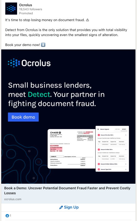
For users at the bottom of the funnel, get right to the action of conversion. Use strong copy and incentives, and don’t pull any punches with your CTA: “Sign Up,” “Book a Demo,” “Shop Now.”
This Ocrolus ad cuts right to the chase with its messaging and “Book demo” CTA:

Creative Upkeep
Perhaps the most important thing to remember about great creative is that even your top-performing versions will eventually go stale. Set a cycle for refreshing top creatives, introducing new themes and personas and testing different messaging as user needs evolve.
If you need any strategic guidance as you go, reach out to us to hop on a call.
